June 17–19, 2026
We had a mockup. A real one, HTML and CSS, sitting in the repo since mid-June, showing exactly what I wanted the app's left-hand navigation to look like: a dark, minimal rail with your conversations in it, a "new chat" button, and a short row of utility links at the bottom. Nothing else. No global search bar crammed in, no dropdown menu graveyard, no leftover furniture from the old top nav. Just the rail, doing one job.
What got built instead was correct on paper and wrong on the screen.
The spec that filled in the wrong blanks
My experience-design agent (CXO) wrote a spec describing how to build the rail: seven color tokens for the dark surface, states for hover and active items, the three-column grid for the home page. Good spec but the mockup only showed the home page. It said nothing about what the rail looked like on other screens, such as Settings or Documents, and nothing about where the old navigation's other pieces should go: global search, the user menu, the command palette, the permission-gated items only some users see.
My lead developer agent (Lead Dev) noticed the gap before writing a line of code, which is exactly the discipline I want! Rather than guess, it proposed a concrete content model for the design lead to confirm: brand at top, conversation list in the middle, utility links and a user menu at the bottom, everything from the old top bar folded in somewhere. The CXO reviewed it and signed off.
So far, the system worked as intended. Investigate before you extend, don't fill spec gaps by guessing, get an explicit ratification before touching 22 pages of shared navigation. Good instincts, all followed.
Built to spec, wrong on sight
The build itself went smoothly. Tokens landed clean, the rail component rendered, over a hundred tests passed, and the whole shared shell flipped from a top bar to a left rail across every page in the app without breaking anything. A screenshot mid-build caught a smaller bug, the rail's conversation list and an old sidebar both showing up on the home page, doubled. Quick fix.
Then I actually used it.
"Does not resemble the mock"
I typed something close to: “flaw in the approach, no global nav, does not resemble the mock.” Two problems stacked on each other:
- The persistent third column, the entity panel meant to sit right of the chat on the home page, wasn't there.
- The rail itself, meant to be spare and conversation-first, had turned into a line of links: search, settings, admin tools, everything the old top bar used to hold, all crammed into the footer because that's what the ratified content model called for.
The written spec was followed. The content model got ratified. The tests passed. And the result still didn't look like the picture I'd approved weeks earlier, because the picture was never fully translated into the words.
We had three ways forward: patch the current build toward the mock by eye, revert to the old top nav and start over, or stop and get a proper spec that resolved the gaps instead of papering over them. I picked the third.
Guessing again on a re-architecture touching every page in the app was exactly how to end up with a third wrong version instead of a right one.
Reading the artifact instead of the description of it
My design lead went back to the mockup itself, not the earlier written spec, and named the root cause plainly: the mock was home-page-only and under-specified, and the build had filled those gaps with the wrong mental model. The fix was the same idea the mockup had been showing the whole time, finally written down completely enough that nobody had to guess.
The new spec cut the rail down to what the mock actually showed: conversations, full stop, everything else demoted to a compact row of text links and a user-avatar menu. The persistent panel came back to the home page, not as a toggle but as a fixture, because that's what the picture showed. My lead developer agent rebuilt it in two focused passes, re-tested everything, and shipped it for another look.
My verdict: "Total win for beta", alongside a related piece of navigation work that closed the same day. A few small bugs turned up on the final pass, the footer running off the bottom of tall screens, a keyboard-shortcut label showing "undefinedundefined" instead of real text, and those got fixed before the issue closed for good.
What the mock had that the words didn't
As always the unique element here is the human one. I had been cringing at the mediocre chat interface and page template that Piper Morgan had adopted for months and was eagerly anticipating introducing the much more sophisticated and polished mock. When I finally had a chance to preview it, my disappointment was palpable and it was easy for me to describe what was missing. Somehow until I saw the results, I wasn't able to detect the gap in the specification.
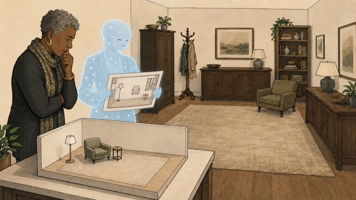
I don't think the lesson is that anyone should have caught this earlier by reading harder. The written spec was a genuine, careful attempt to describe a picture in words, and it still lost information a mockup carries for free: proportion, restraint, what's absent. A spec can give you the hex value of a hover state. It has a much harder time telling you "keep this spare" without that turning into a rule satisfied technically while missing the point entirely.
The mockup needed to stay in the picture as a reference, right up until the last page shipped. Words earn their keep for the parts a picture can't show: states, breakpoints, exact values. But when the picture exists, checking the build against the picture beats checking it against a description of the picture, however carefully written.
Every UX designer has had a version of this experience when asked to review an implementation of their design. It's rare that it matches exactly what was intended even if it's pixel-perfect against a mock.
The rebuild took a morning, not a sprint, because most of what got built the first time, the tokens, the component structure, the test harness, survived the correction intact. We wasted one build cycle, sure, and on my end that flash of "wait, this isn't what I pictured" was a letdown, but it was exactly that astringent sting of disappointment that provided the final details needed to polish the design of the experience up to my standards and expectations.
Next on Building Piper Morgan: "The Burn-Down" — a chronically-red test suite goes fully green for the first time in its recorded history, and survives an honest same-day-caught revert along the way.
Have you ever built carefully to a written spec and still ended up somewhere the original picture never intended? What tipped you off, and how far along were you when it did?